 We've already seen many of the Top Clues You're in a Silver Age Justice League story: Notsoinanimation, Marshalation, Super-Spinning, Serialocution, & Strange-Compellification.
But those lofty and rarefied concepts are now joined by a clue so raw and visceral that it slaps you in the face like a steaming kielbasa. Ironically, it has nothing to do with the JLAers themselves....
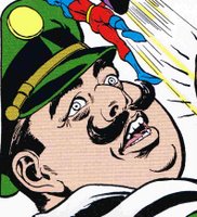
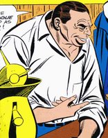
It's their foes. They're butt ugly.

Now, I'm not talking about Drama Scarring, the external facial damage that mars otherwise normal or handsome features, serving as a metaphor for toll life can take on the soul. Two-Face, Dr. Doo
 m, the Joker, the Phantom of the Opera -- their horrific appearances are the scars of tragedy, anti-merit badges that make their bearers larger than life.
No, I'm talking about the mundane, soul-sucking ugliness of the waders in the gene pool's shallow end, the losers in the DNA lottery. The foes of the Silver Age Justice League are knob-kneed, weak-chinned, bug-eyed, spindly-armed, melon-headed, pencil-necked freaks of nature. Whether ranine, vulpine, murine, meleagrine, or serpentine, their distressingly repulsive features sicken you as much as their vile deeds; ellos son los feos en el amo. They are the personifications of
FOEFEOSITY.
 Theirs are not the faces of supervillains; they are the faces of the pedestrian banes of our daily lives: The Trigonometry Teacher, the DMV Supervisor, the Plumbing Contractor, the Biochem TA, the Deli Butcher, the French waiter. They wear, not colorful costumes, but business suits, labcoats, drab overalls, and monochromatic unitards. They seldom have any instrinsic powers, relying on alien gadgets, "strange forces", and elaborate schemes.
The Silver Age foes of the Justice League, with their enlarged nostrils, cheesy moustaches, blackened eyebags, and bushy eyebrows represent our true fears. In real life, seldom do we lie awake, worried that "evil" will overwhelm "good"; we know that most people will usually behave "good" because they know that the preservation of a well-ordered, safe society is in their own best interests.

Our real fears are that our lives will be tedious, not fabulous. That the colorful, splendid, and optimistic will be overcome by the petty, the tedious, and the embittered. That those without our gifts or talents will squelch us, control us, neuter us with their social gadgetry, strange political forces, and elaborate bureacracies. Our real fear is that the very "well-ordered safe society" that makes people be good will be taken over by the hidebound and narrowminded, who will stamp out the outstanding, no matter how selfless or virtuous they may be.
Or maybe Sekowski could only draw ugly people; who can say?


16 comments:
Mike Sekowsky was hard-pressed to draw someone pretty, but this gallery of ugly made me think that he may be a much better artist than I previously thought: especially the chubby face of the fifth fellow.
And! Damn, I had to look up most of the animal-references. I had no idea that "vulpine" was "foxlike."
A good point, though, about how our Silver Age heroes grappled with mundane everydayness: fighting against the suburban malaise of the 50's and 60's, perhaps?
http://www.sufferingsappho.com/wrap/art/SekowskyWW1.jpg
http://images.heritagecoin.com/images/HNAI/75/817/817001385c.jpg
Sekowsky could draw conventionally-handsome people just fine -- but unlike way too many artists of today, he never limited himself to it. John Buscema also liked to draw bizarre faces on villains, though his tended nore toward the dramatically-bizarre than the mundanely-so, with Big Mike's.
But I'd much rather have that than an endless parade of the same face with minor prosthetics to differentiate them...
kdb
I like that Sekowsky didn't give us the same faces over and over in his villains. But heroes (and sypmathetic third parties) were another matter. I think John Byrne was the first - at least the first I noticed as a kid - who gave all the heroes distinctive facial features. Or at least, all the male heroes. :)
I was just thinking about that the other day, watching "Justice League Unlimited." I was stunned -- stunned, I tell you! -- by the difference between the homely, jug-eared, scarecrow-bodied, and doubtlessly rickets-addled version of Sinestro that Gil Kane used to draw, and the broad-shouldered, football-necked dreamboat on the cartoon. Even the Key is hardbodied on that show! And he was no great shakes in the comics, pre-Morrison.
I'd say more but I've used up my daily allowance of hyphens.
But maybe that's just what people look like on Earth-1.
On Earth-2, on the other hand...
Have you looked at who Mr. America slept with?
If you wanted to know if Big Mike could draw pretty, you could check this out.
"the difference between the homely, jug-eared, scarecrow-bodied, and doubtlessly rickets-addled version of Sinestro that Gil Kane used to draw, and the broad-shouldered, football-necked dreamboat on the cartoon."
Yeah; I guess Sinestro is the Will Smith of villainy.
Sure Diana Prince/Wonder Woman looks beautiful in the Mike Sekowsky artwork, but how much of that is due to the Dick Giordano inks? I think Giordano probably smoothed over Sekowsky's awkwardness a bit. That said, I do love Sekowsky's art...
"Our real fear is that the very 'well-ordered safe society' that makes people be good will be taken over by the hidebound and narrowminded, who will stamp out the outstanding, no matter how selfless or virtuous they may be."
Huh. That sounds kinda like a descendant of the film noir aesthetic. The "everyday world" is a trap, conformity is death, society is a prison, etc. Weird.
I've got to agree with Balger. The Diana Prince art looks super-Giordano to me. I was looking through some old Supermans yesterday and thinking, wow! What a great Giordano cover!
Then I realized it was Ross Andru with Dick mashing down on the brush. I also seem to remember him demolishing some Perez pencils at one point or another . . . and maybe doing some Byrne inks in the Action days, which broke my pre-teen heart (Byrne fan that I was).
Dick Giordano's a heavy inker, and one who looks great over Sekowsky, but Sekowsky pretty girls look like pretty girls pretty mch no matter who's inking him.
Okay, maybe not George Roussos, but I love that stuff too.
kdb
Well, how could Sekowsky not draw a pretty Wonder Woman with this girl as a model?:
http://hometown.aol.com/linastrick/sekowsky.html
Harvey...
Now that you mention it, those guys do look like the bad guys in noir films.
It is weird.
N.W.A totally ripped off that last panel for the cover of Straight Outta Compton.
The thing that makes Sekowsky's art from those early JLA appearances stand out is that he draws in a realistic, Milton Caniff inspired style, not often seen on superhero comics, which tend to go for exagerration in one way or another. None of his heroes looked much like proper superheroes either, but like real people.
Anyone who says Sekowksky can't draw beautiful men need to double-check the Green Lantern parts of the stories.
*sighs* Paul Neumann Hal... So beautiful...
Post a Comment